Charting Automated Weather Station Data
When it comes to forecasting avalanche conditions, an important element is looking at the data and trends of the last 24 hours. For this, automated snow stations, as discussed yesterday, are great, but they present you with an snoot-full of data that can be hard to decipher. Instead, what I like to do is have Excel import the data, then chart it for me so that with just a quick glance, I can see if it got above freezing during the day, if the winds were howling while I slept or how much new snow came down.

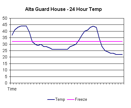
- Charted automated weather station temperature data. At a glance, this looks like good corn snow conditions with cold nights and warm days. Too bad there is no snow to corn up.
Ninety percent of charting this data has to do with being familiar with Excel, of which I know just enough of to figure out the basics. I learned how to do this while working at the Utah Avalanche Forecast Center where I had set up an elaborate version. The downfall of this is that the weather stations often go down, or some weather tech guy/girl changes the data format, so they fancy systems never worked for very long. I’ve since simplified my strategy and only use a few select chunks of data from the most reliable stations, then use the charts as starting points for looking at the snow pack whenever I go out. Once you get the charts set up, it is only a matter of hitting the “refresh” button to get them to instantly update with new data.

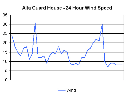
- 24 hour wind graph. If there was any new snow associated with this period, avalanche danger would most definitely be going up. Charts like this are useful as you may show up at the trailhead with no apparent wind (right hand side of the graph), yet it has obviously been windy for the last 24-hour period.
How to Chart Automated Weather Station data Geekfest:
Importing Weather Data
Open a blank Excel spreadsheet document
Place your cursor in the top, left hand box (A1)
In the top toolbar, select “Data”
Under “Data” select “Import External Data”
The “Select Data Source” window will open
In the “File name:” box, insert the entire html address of your weather station of choice
Click “Open”
Excel will connect (hopefully) to the weather station and display a group of little arrow icons on the fields which are extractable
Click on the table which holds the actual weather data (time, wind, etc…)
Excel grabs the data and inserts it into your spreadsheet
Charting
Save your data on “Sheet 1”
Go to the blank “Sheet 2”
Select “Insert” on the main toolbar, then “Chart”
Click where you want the chart to be
Select what kind of chart you want (I like the basic “line” chart)
On the next window, where it says “Data Range” click the little range box to the right, then go to Sheet 1 and drag your cursor down the data column you want to chart (wind, temp, etc.)
From here, click through a bunch of color, line and title boxes, then, voila! you have a chart of the last 24 hours.
Updating
Save your spreadsheet with a suitable name.
Now, once you open this spreadsheet again, you can hit the “Refresh Data” button on the External Data toolbar and Excel will go to the website, grab the latest info and insert it and the charts will update. Neat-oh!
________________________________
Help support StraightChuter.com and remotely grab your Brunton info with a Brunton ADC Infrared Reader from Backcountry.com! Click on the photo below…
Category: 07 Avalanche Avoidance


Geektastic!
But what’s with the Farenheit? Shouldn’t a snogeek post be in Celsius?
Thanks for the step by step directions. This will really impress the chicks.
No kidding. As a designer and an ex-avalanche forecaster, I would love it if the entire world went to the metric system. What kind of measurement is 19/64ths? Painful.
Hey Andrew, long time listener first time caller. I’m a grad student at the U of U Dept of Meteorology. I’m not sure if you’re familiar with the MesoWest interface, that our dept runs. They have the data plotted up on their website. For instance, by station:
http://www.met.utah.edu/cgi-bin/droman/meso_base.cgi?stn=agd
or you can use the google map interface to check out stations around the wasatch/western US:
http://www.met.utah.edu/cgi-bin/droman/mesomap.cgi?lat=40.5905&lon=-111.638&radius=25&rawsflag=290&site=AGD
also, they have a new plotting thing, so you can look at 2 stns at the same time:
http://mesowest.utah.edu/cgi-bin/droman/stn_driver.cgi?unit=&timeout=&time=&hour1=&day1=&month1=&year1=&past=0&g1auto=1&g2auto=1&g1min=&g1max=&g2min=&g2max=&gsize=1.5&linetype=colorline&hours=120&stn1=agd&graph1=SNW&stn2=iff&graph2=WND
Hope this is helpful. Oh, AND you can choose metric or english units, depending on how much of an American you are.
Hi Greg –
Well now… that is SUPER cool! Thanks for bring it up. When I was forecasting, a lot of these things were being discussed, but either didn’t exist yet, or were so bug-plagued that it wasn’t worth going back more than once. It’s cool to see that they now exist.
I really like the Google map. And the high/lows on the charts. And, all the rest of it. Nice job!
i would like to know why 2 temperatures are displayed on the webpage displaying the weather forecast?
i would like answer to teach my son on weather forecast.
Thats really useful information there, about charting the data through excel.
Although we dont have avalanches over here, im sure this could be set up for our weather conditions here in the UK. Nice read thanks